You can't undo a sent email!
Client: Digital Futures at Work Research Centre
This project couldn’t have come to us at a more timely moment, after lockdown had forced many of us to work remotely from home. Clients and colleagues we’d been used to talking with in person had been replaced by video calls [which quickly became tedious] or email.
The DIGIT [Digital Futures at Work Research Centre], co-led by the University of Sussex and Leeds tasked us with producing a short animation and supporting infographics to explore the later. The brief was to convey psychologist Dr Emma Russell’s research into why we send those emails we all wish we hadn’t, and how we can act differently in the future.
It was agreed that we wanted to keep it light and fun. We wanted to engage and disarm people - so decided to convey emotion by characterising the emails themselves. Using emoticons as inspiration we looked at playing with the symbol and shape of a mail icon.
We wanted to easily convey the extremes of how we can come across digitally, as emails can be interpreted the wrong way so easily. Using the top fold of the envelope symbol we created a rig that could easily switch from angry – where the fold creates a frown, to switching up and creating a happy face, where the fold creates a big smile.
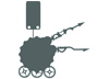
Using a 1950’s stylistic influence was our way of harking back to a simpler time, when we didn’t have to concern ourselves with how our digital personas are perceived and received.
Credits: |
|
|
Research: |
Dr Emma Russell |
|
Design & Direction: |
Simon Armstrong |
Services:
- Concept Development
- Scripting
- Design
- Storyboarding
- Animation
- Audio Production
- Print Mediums [ Infographic and Posters ].
Don't choose Dark Mode...
As the ‘bad’ emails arrive the screen changes from light to dark [evoking how mobiles have two display modes] to subtly suggest how negative email behaviour can affect the recipient’s mood in turn.
Subtle reactions and movements from the world surrounding the device again re-enforced how impactful sending poor emails can be and in turn affect and influence the response.
We also created a supporting infographic and posters for use in presentations and workshops.


The posters were created as a fun series of warning / wanted posters – highlighting the issues and drawing people in to stop and reflect on how they could act differently.
We wanted the characters and themes to elicit a feeling of recognition - we’ve probably all done it - but most importantly, a prompt to recognise why it happens and encourage reflection…. Just before they fire off that email.
Adding expression to an email...
We had a lot of fun creating a variety of expressions formed from the top fold of an envelope. Adding various glifs, graphics and symbols really helped re-enforce the emotions at play whilst acting as a not so subtle nod to the texting generation.
“Ticktockrobot were a pleasure to work with from start to finish, going above and beyond to deliver an excellent product on time and to budget. We wanted to communicate key insights from the research in a fun and engaging way, illustrating some of the reasons people send problematic emails and how they can act differently. We’re delighted with the results.”
Emma Russell, Chartered Occupational Psychologist
Digital Futures at Work Research Centre
University of Sussex Business School